Review from the Founder
"Friendly and professional attitude. Knowledgeable and helpful in every aspect. Throughout every step of our collaboration, the project was handled with sufficient attention and professionalism, and I was completely satisfied throughout. Everyone highly appreciated the result. I recommend Humbl Creatives to anyone looking for a graphic designer."
Daniel Spergel
@summit_endurance


Summit
Summit
We've always dreamt of creating a brand with a mountain theme because we're big fans of adventures, sports, and nature. Our top designer, Gary Fodor, was super excited to create a brand identity system, custom t-shirt, and social media designs for Daniel Spergel's awesome new brand, Summit Strength and Endurance.
We designed a brand that really captures Daniel's ambition to become the go-to expert for mountain climbers. He's all about providing tailored strength and conditioning training to help them conquer any mountain with confidence. And in the future, he's planning to expand his brand by bringing in more expert coaches.
Scope
Logo Design
Brand Identity Design
Brand Style Guide
Iconography
Patterns
Website Landing Page
T-shirt Design
Social Media Design
Logo Design
Brand Identity Design
Brand Style Guide
Iconography
Patterns
Website Landing Page
T-shirt Design
Social Media Design


01
01
01
Creative Brief & Strategy
Creative Brief & Strategy
Creative Brief & Strategy
In our initial conversations with Daniel, we found out that he's determined to introduce functional training for mountain climbers in Hungary. He's excited about building a supportive community where everyone can encourage each other to reach their goals and have a great time during training sessions.
In our initial conversations with Daniel, we found out that he's determined to introduce functional training for mountain climbers in Hungary. He's excited about building a supportive community where everyone can encourage each other to reach their goals and have a great time during training sessions.
02
02
02
Creative Direction
Creative Direction
Creative Direction
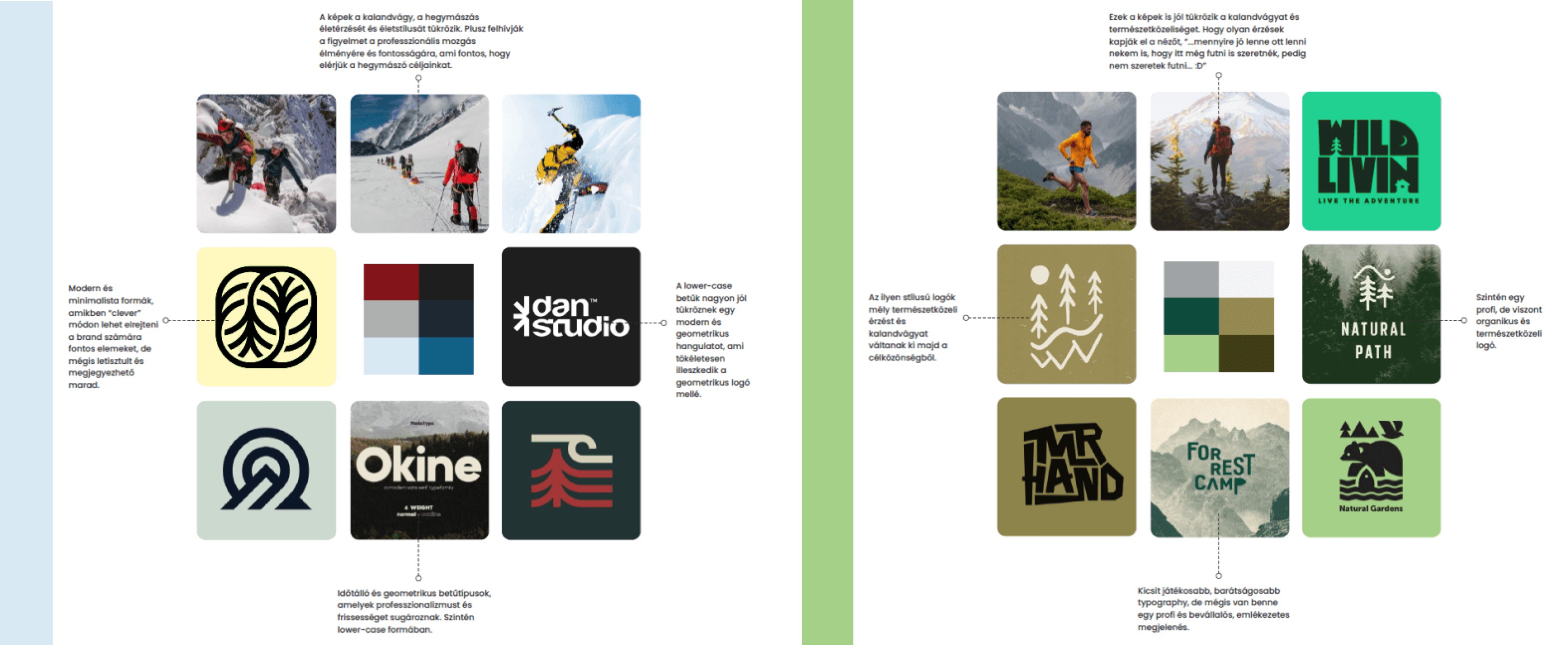
After working on Daniel's brand strategy and brief, we offered him two mood board directions to choose from. One had a sleek and professional look, featuring blue tones inspired by mountains, while the other had a community-focused, welcoming style with bold green and brown colors. Daniel ended up going with the professional blue option because it resonated more with his vision, but he really liked both and had a hard time making a decision.
After working on Daniel's brand strategy and brief, we offered him two mood board directions to choose from. One had a sleek and professional look, featuring blue tones inspired by mountains, while the other had a community-focused, welcoming style with bold green and brown colors. Daniel ended up going with the professional blue option because it resonated more with his vision, but he really liked both and had a hard time making a decision.



03
03
03
Making the Logo
Making the Logo
Making the Logo
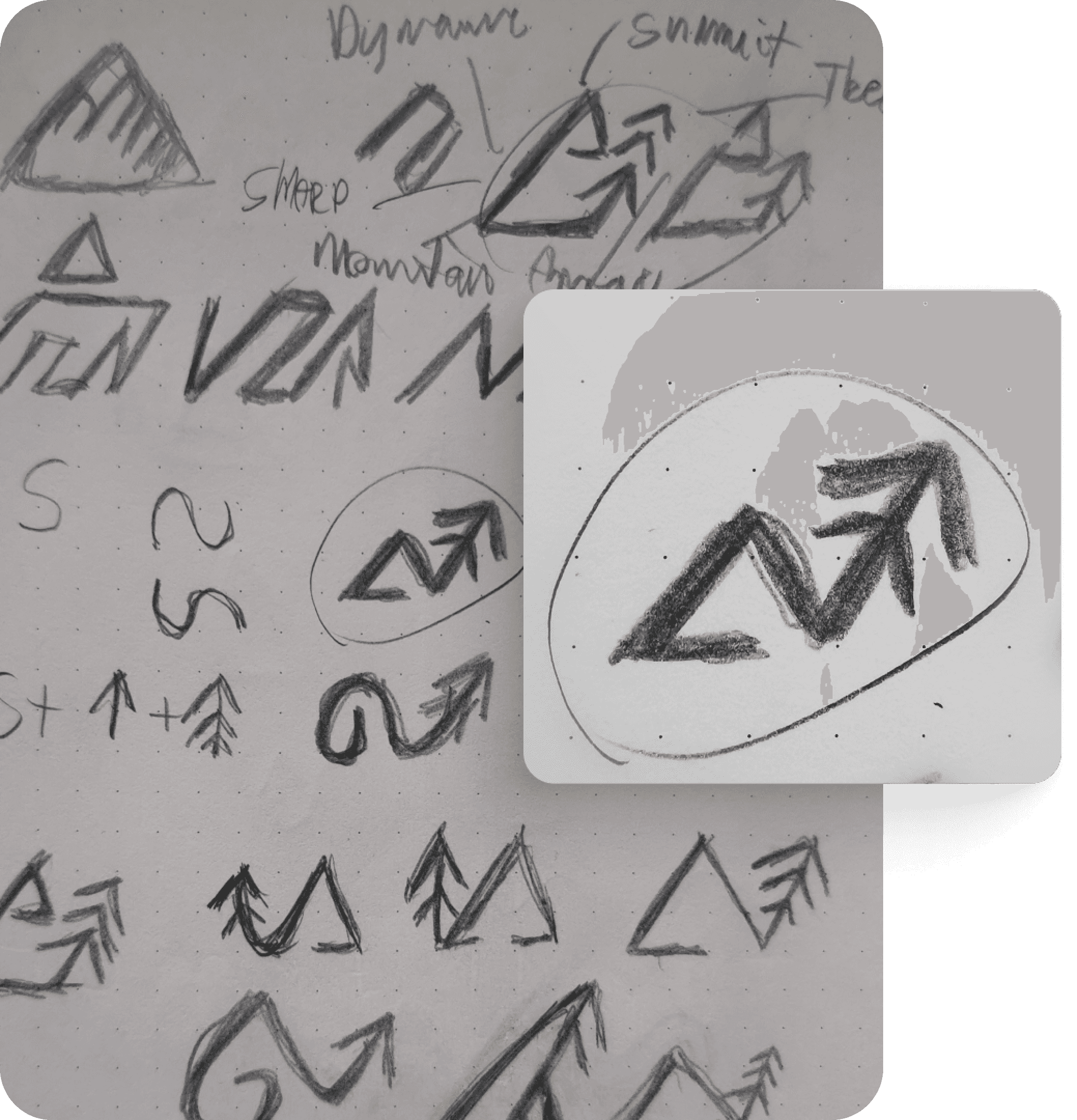
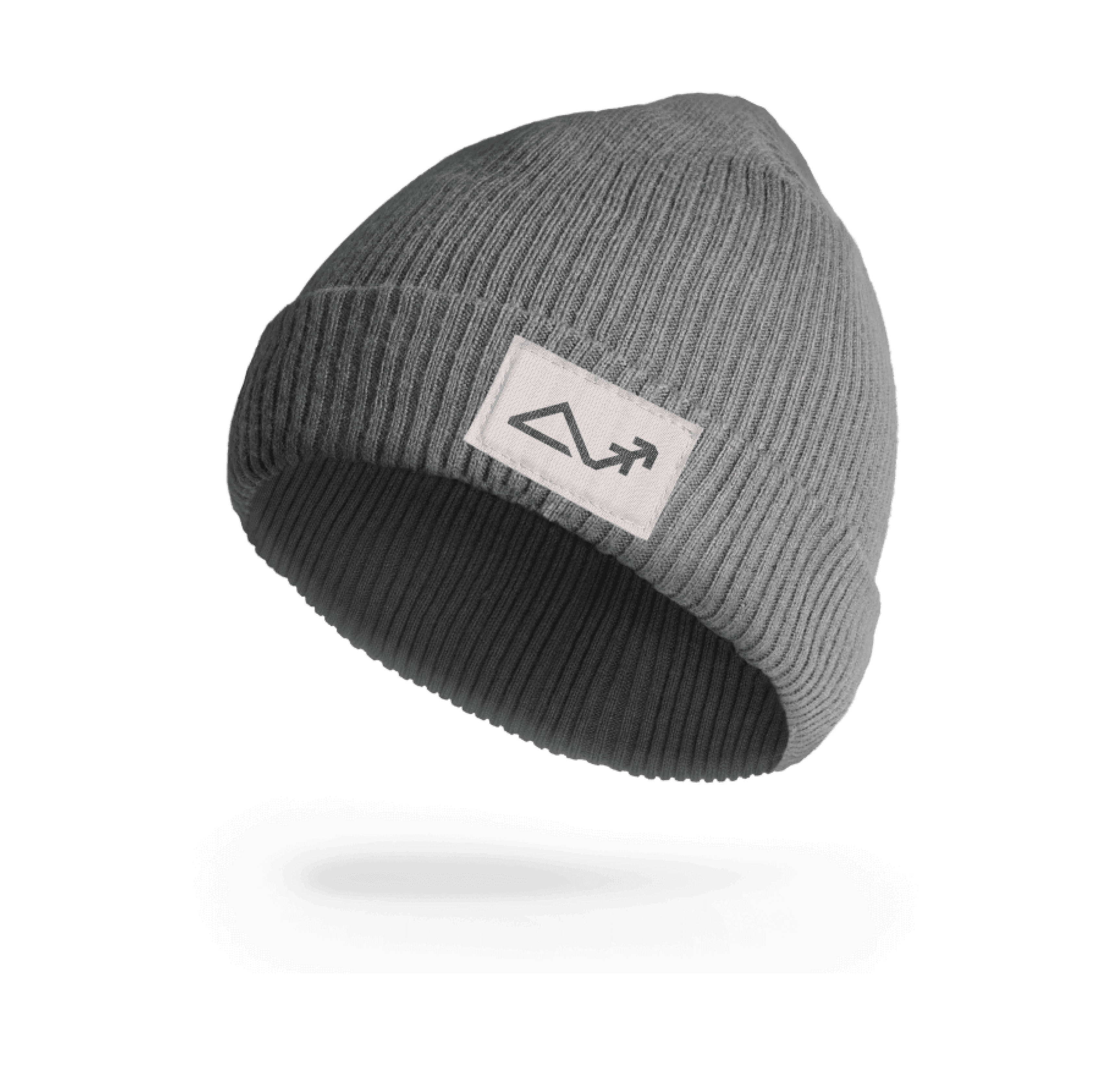
We went through 30-40 rough sketch versions of the Summit logo mark, trying to give it a geometric, simple, and dynamic feel. We really wanted to make sure it didn't look too generic. It was a bit of a challenge to show that it's not just about mountains, but also about fitness training. Also, the mountain element is hugely overused in many logo marks nowadays.
We went through 30-40 rough sketch versions of the Summit logo mark, trying to give it a geometric, simple, and dynamic feel. We really wanted to make sure it didn't look too generic. It was a bit of a challenge to show that it's not just about mountains, but also about fitness training. Also, the mountain element is hugely overused in many logo marks nowadays.




04
04
04
The Grid System
The Grid System
The Grid System
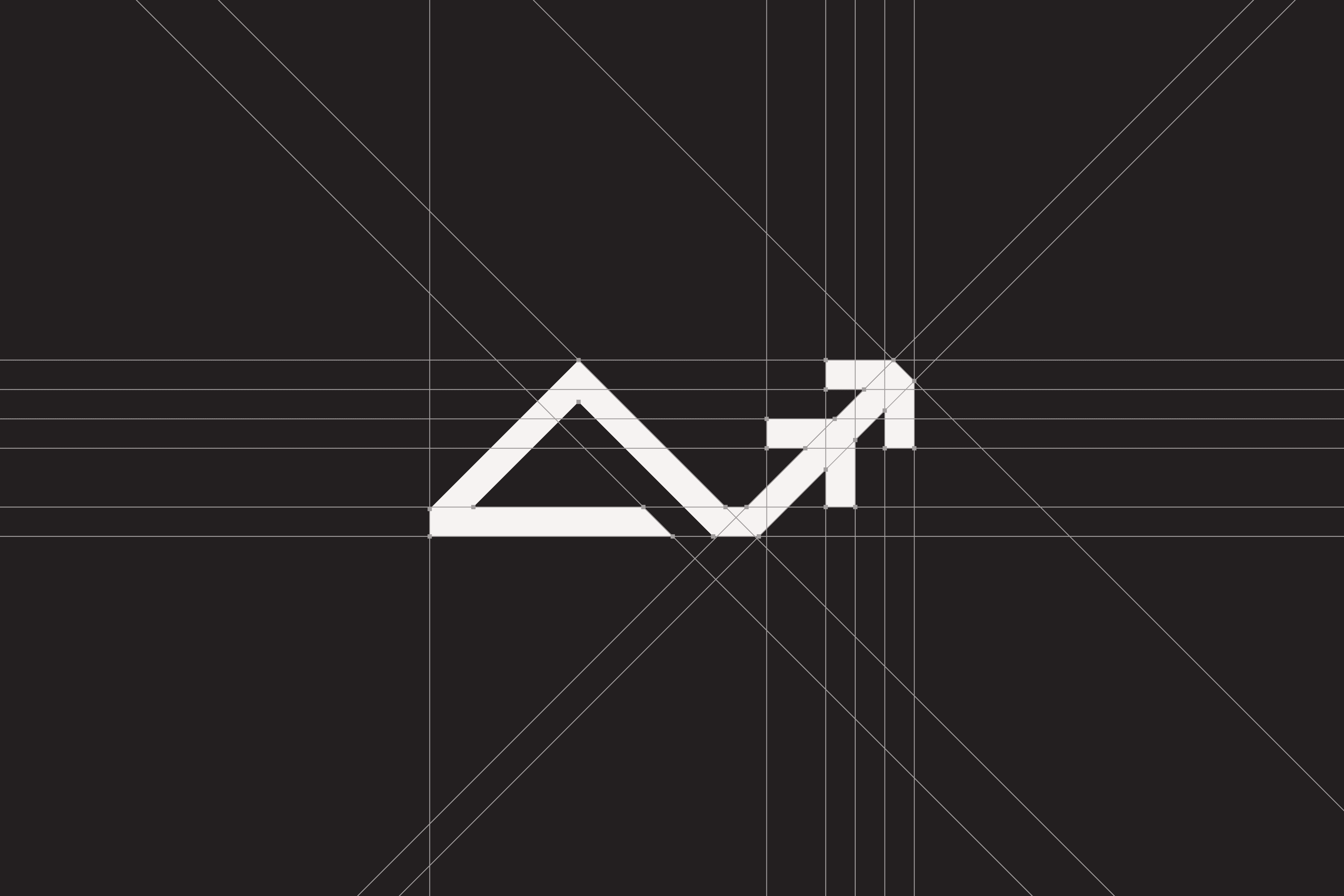
We had a blast creating the logo! We used a grid system to ensure precision and professionalism and incorporated mathematical and visual connections to maintain consistency with even angles, strokes, and spaces. The mountain and arrow/tree elements blend seamlessly to create a balanced visual look.
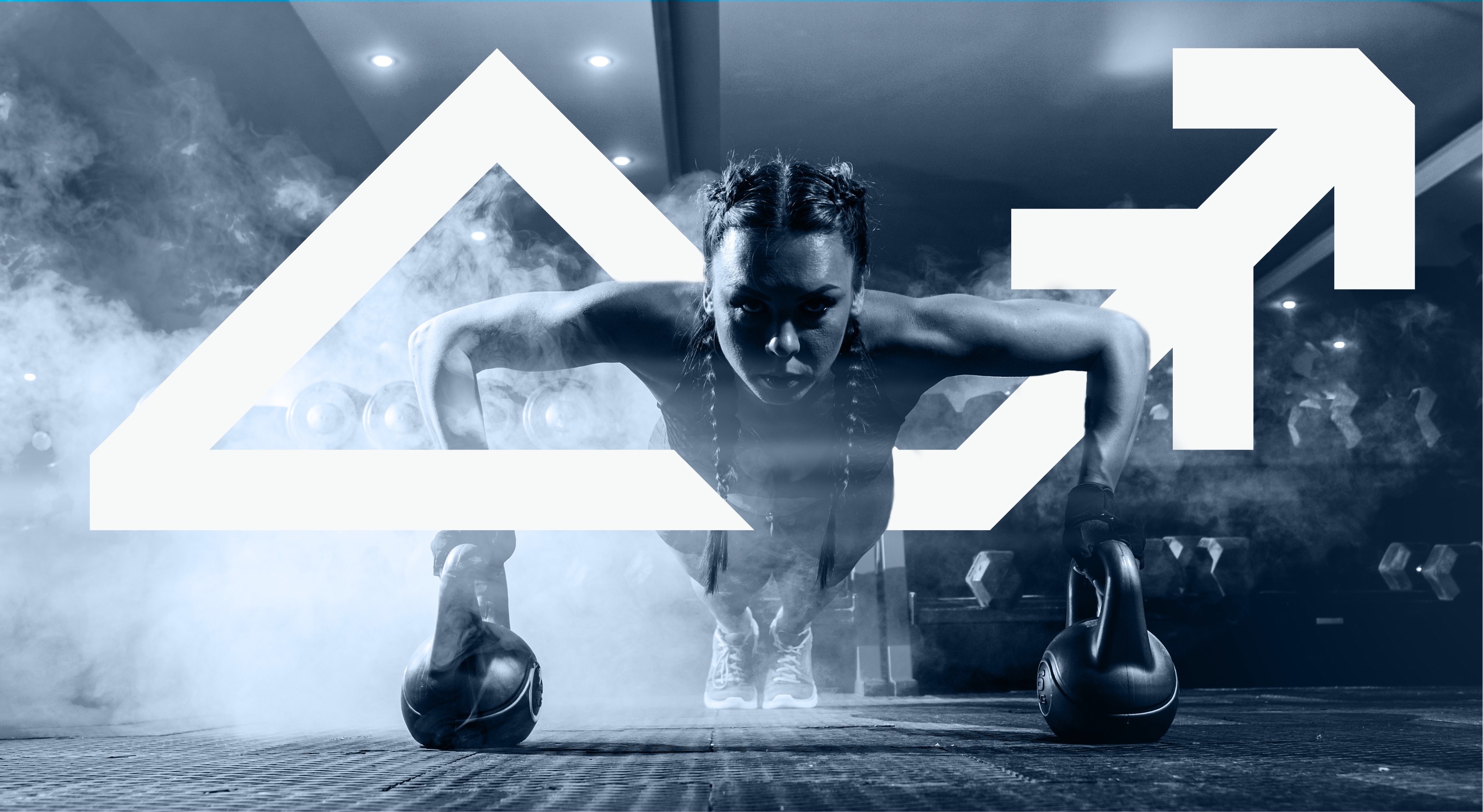
The final version of the logo is truly one-of-a-kind! It has a dynamic, almost Nike swoosh feel, resembling a diagram that symbolizes growth and positivity. The logo, a combination of a pine tree and an abstract mountain triangle element, is geometric, easy to remember, and unique, setting the Summit brand apart from the rest.






05
05
05
Logo Variations
Logo Variations
Logo Variations
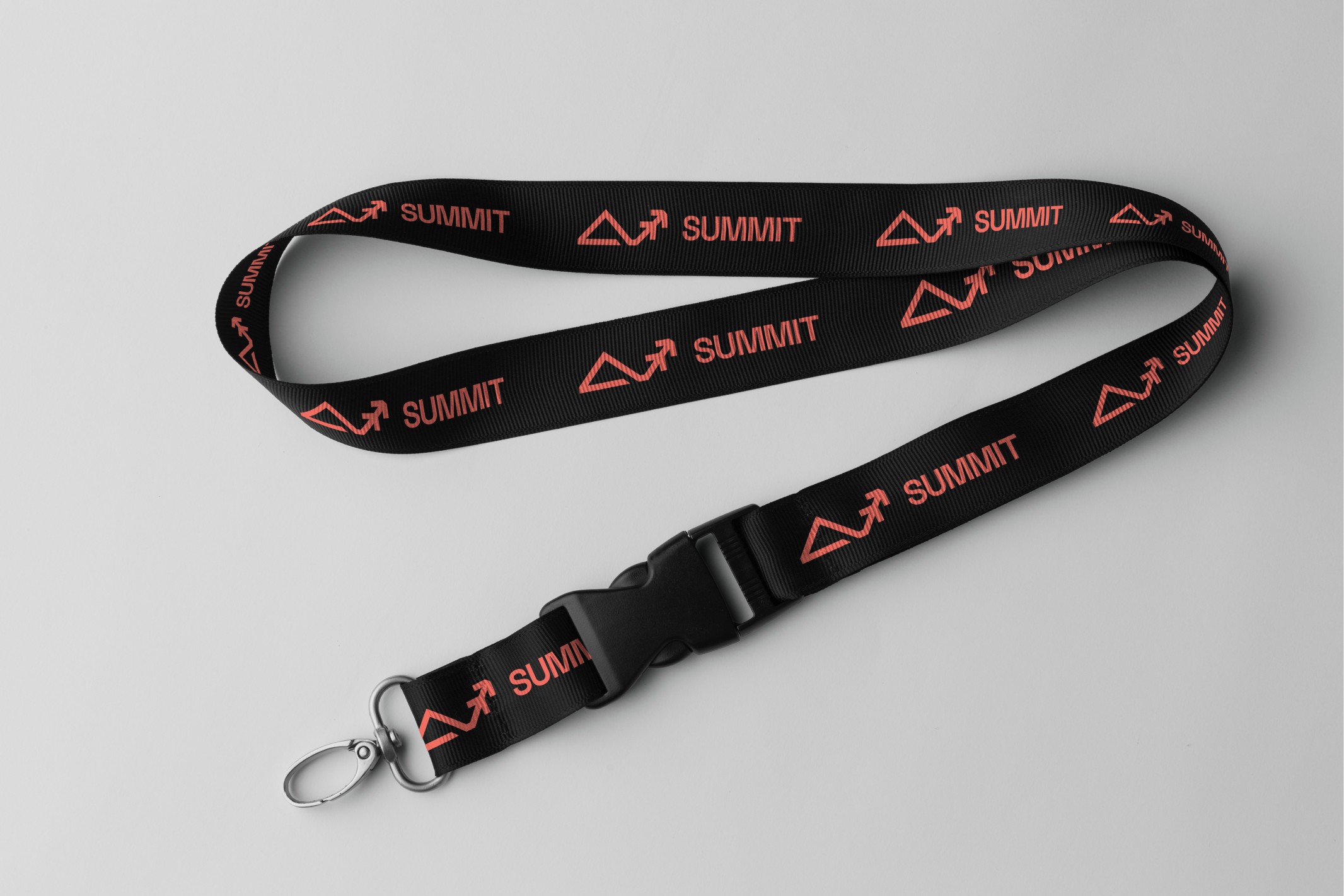
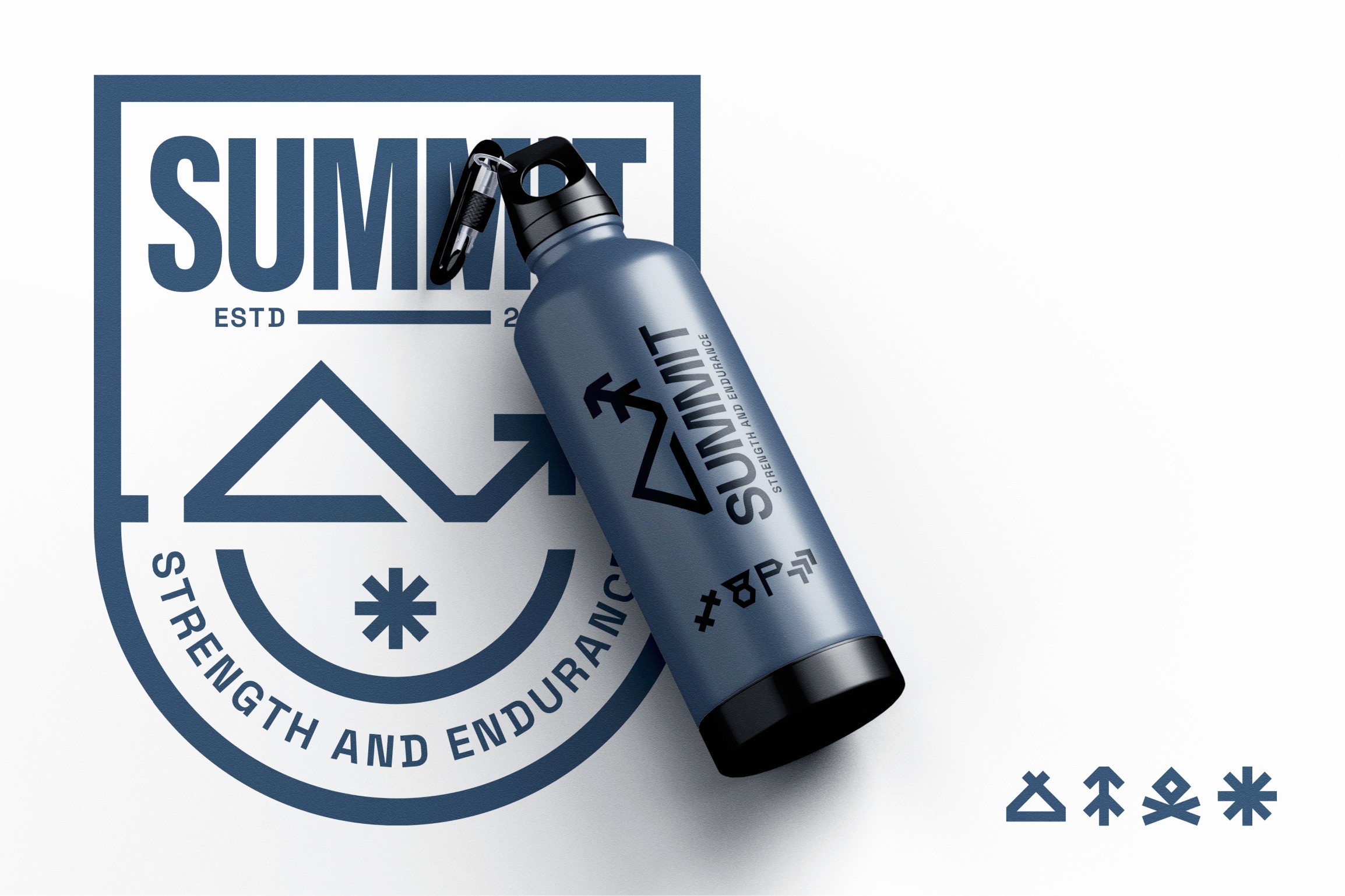
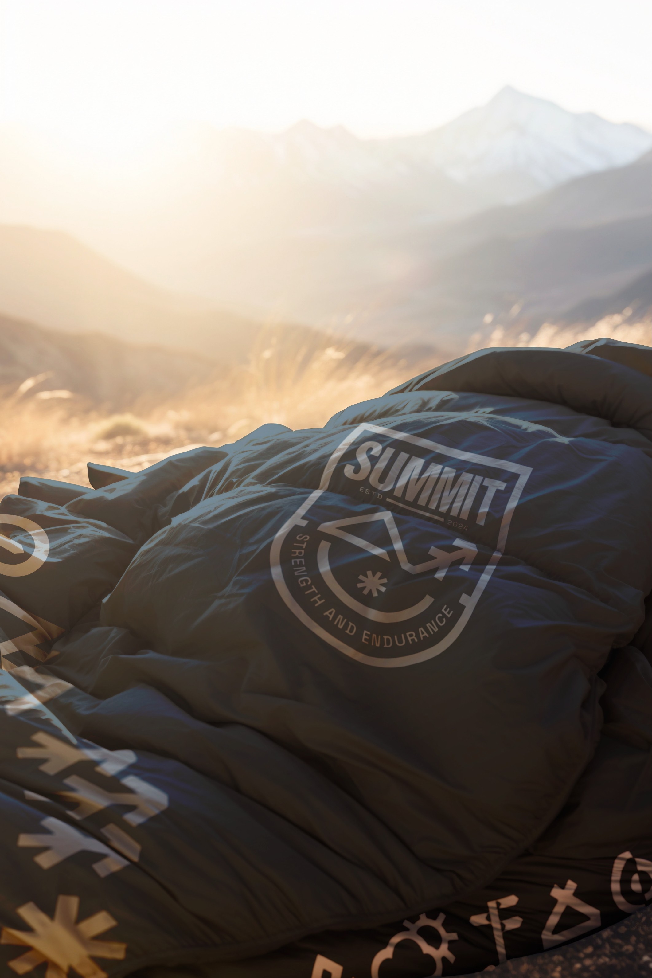
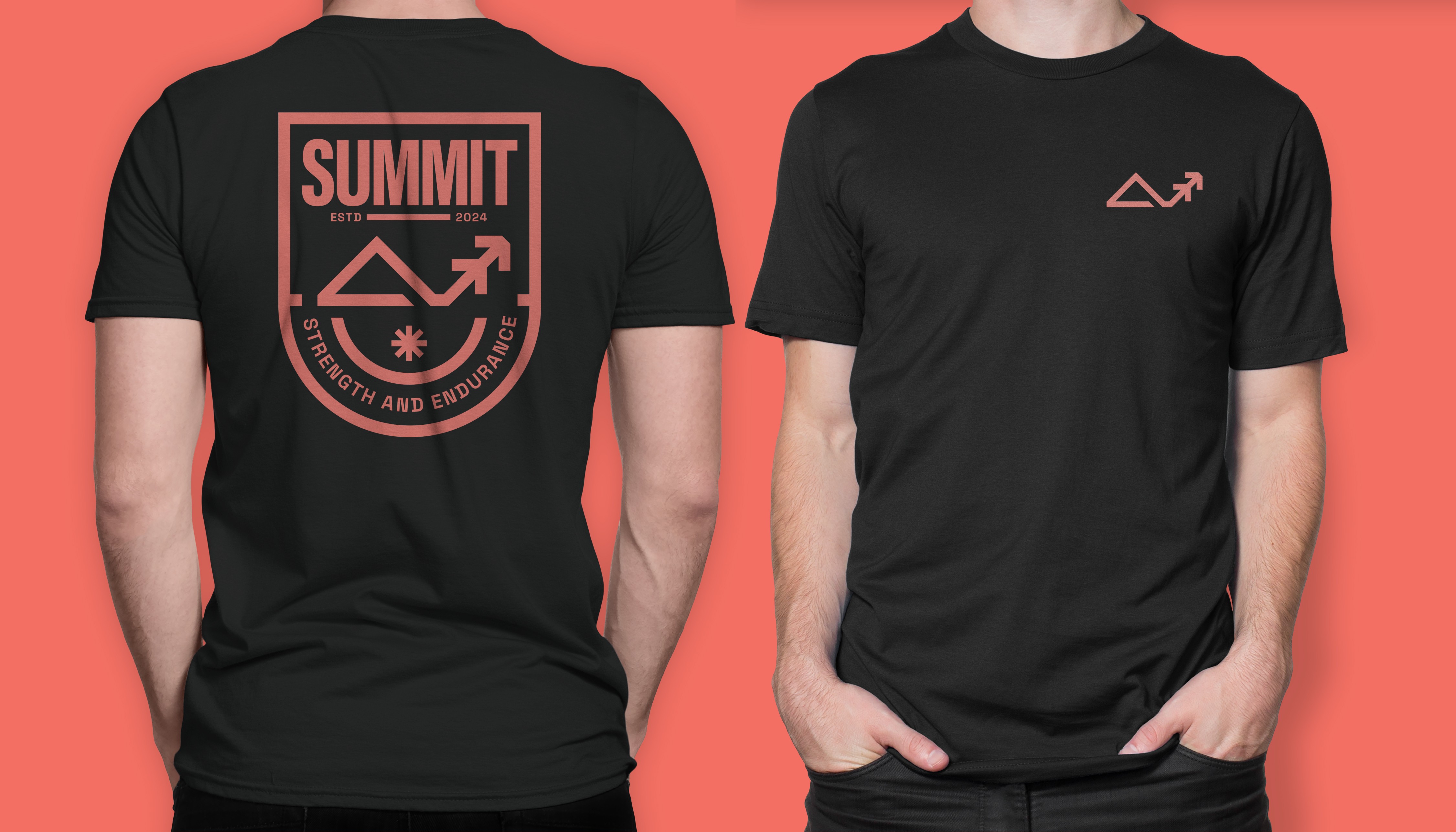
After we finished designing the logo mark, we had fun creating different logo variations to make sure it looks awesome and works well across various platforms. Our personal favorite is the badge variation, which uses a shield shape to give off a feeling of safety and professionalism. It also includes elements from the Summit brand identity, like the snow icon and strokes, to keep things consistent and really capture that mountain climbing vibe.
After we finished designing the logo mark, we had fun creating different logo variations to make sure it looks awesome and works well across various platforms. Our personal favorite is the badge variation, which uses a shield shape to give off a feeling of safety and professionalism. It also includes elements from the Summit brand identity, like the snow icon and strokes, to keep things consistent and really capture that mountain climbing vibe.



06
06
06
Brand Icons & Pattern
Brand Icons & Pattern
Brand Icons & Pattern
To keep things consistent and easy to remember, we came up with a brand pattern using just Summit's logo mark. We had some fun playing around with different angles and variations of the logo, and guess what When we rotated the logo and put four of them together, it made a snowflake shape! We thought this was a pretty neat and memorable idea for Daniel's brand.
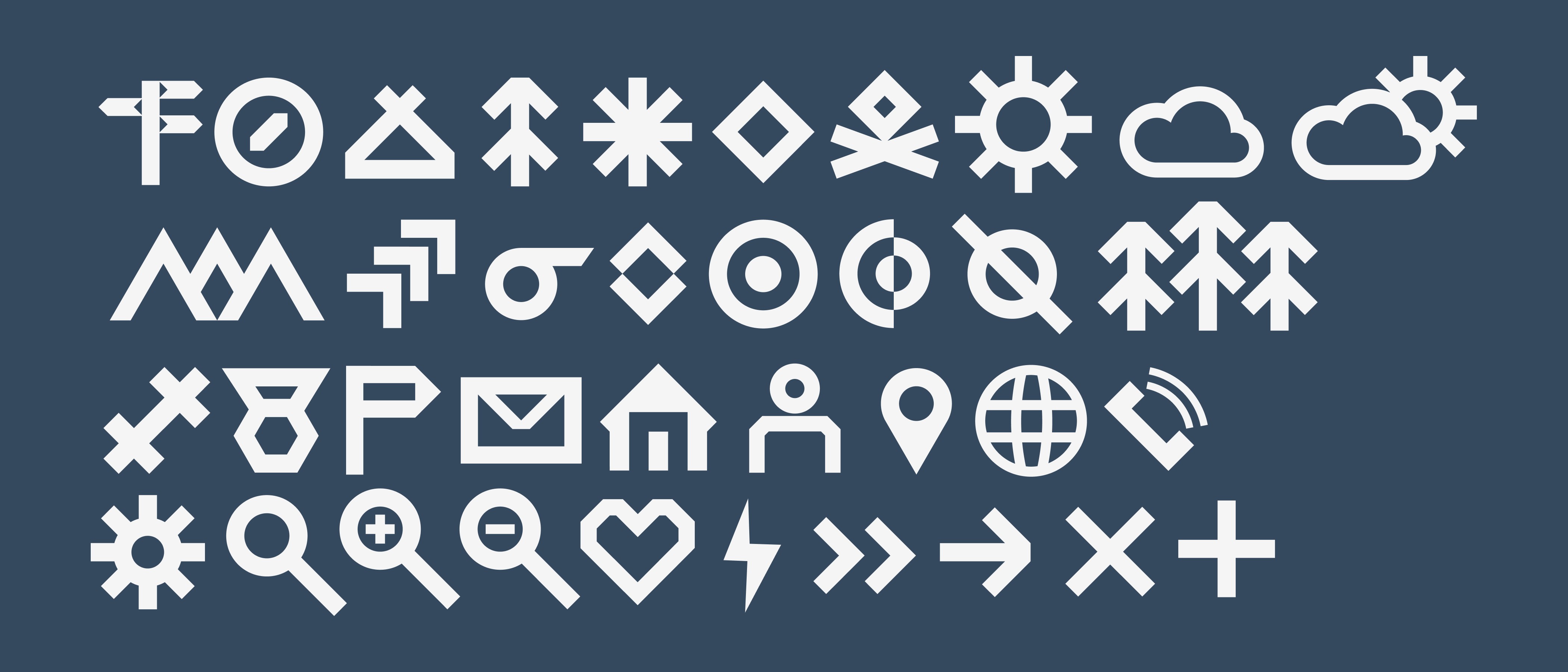
We also designed a bunch of custom brand icons using the same grid system and style to keep everything looking professional and cohesive. These icons can be used as cool illustrations or icons on all sorts of print and digital platforms, like social media, websites, and marketing materials.




07
07
07
Colour Palette & Typography
Colour Palette & Typography
Colour Palette & Typography
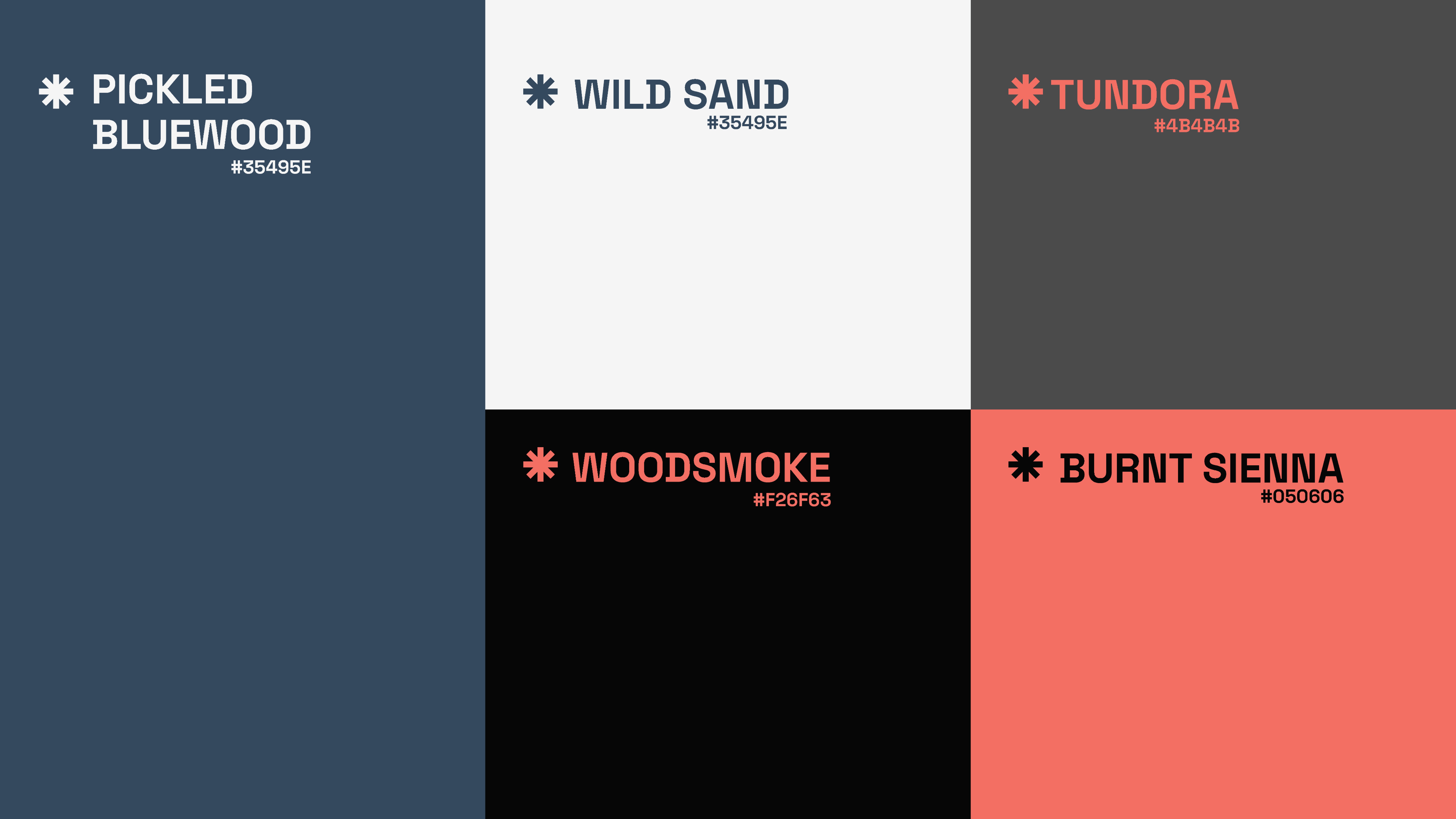
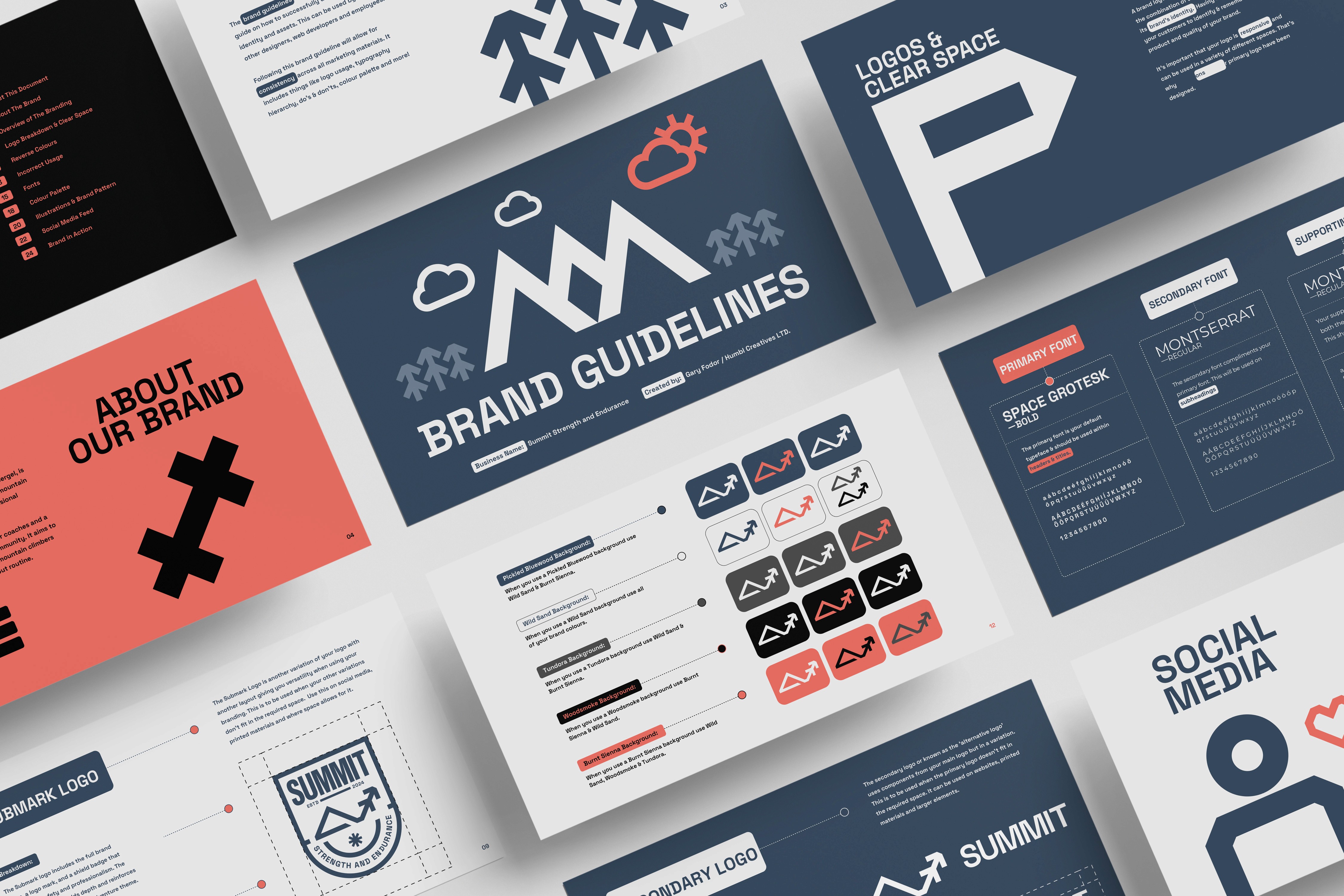
Pickled Bluewood is a deep, professional blue that stands out and pairs beautifully with white, evoking snowy mountains. Wild Sand is a crisp, snowy white contrasting perfectly with our primary blue and other brand colours.
Woodsmoke, a dark smoky grey, is excellent for body text with a cosy campfire vibe. Tundora, a lighter smoky grey, mirrors mountain rocks and adds versatility for digital and print designs. Burnt Sienna, our CTA colour, brings a warm, campfire feel, balancing the cool blues with a soft, adventurous touch.
For the brand typography, we had a challenge choosing a font that knows the Hungarian language and reflects the fitness and adventurous vibes. We chose Space Grotesk as the primary brand font and Montserrat as the secondary and body text font. Both fonts are easy to read and look modern and professional. Also, they're website-friendly, which is a huge advantage.



08
08
08
The T-Shirt Design
The T-Shirt Design
The T-Shirt Design
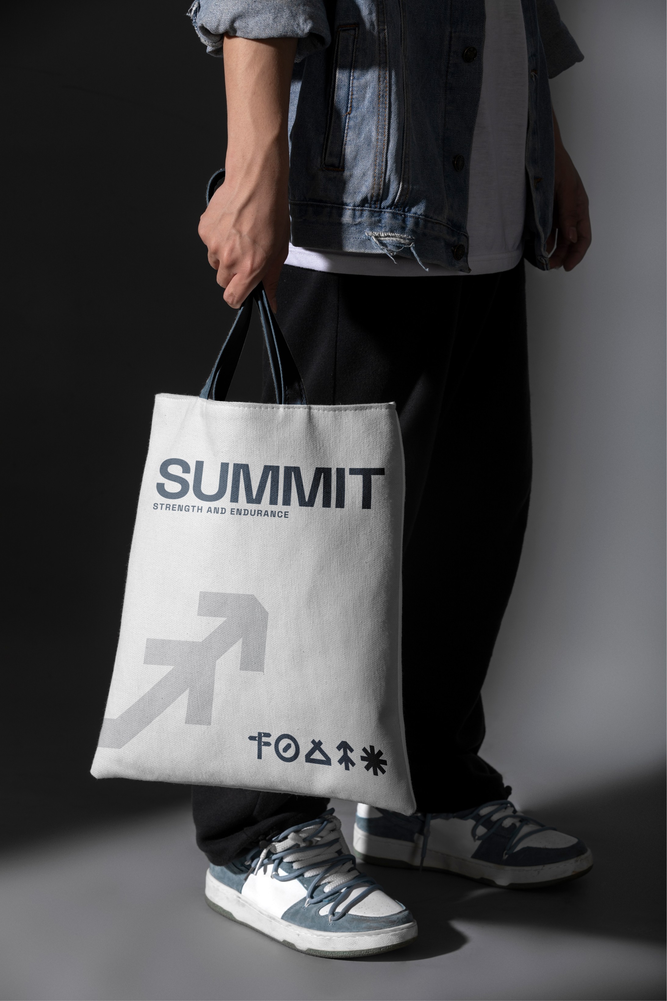
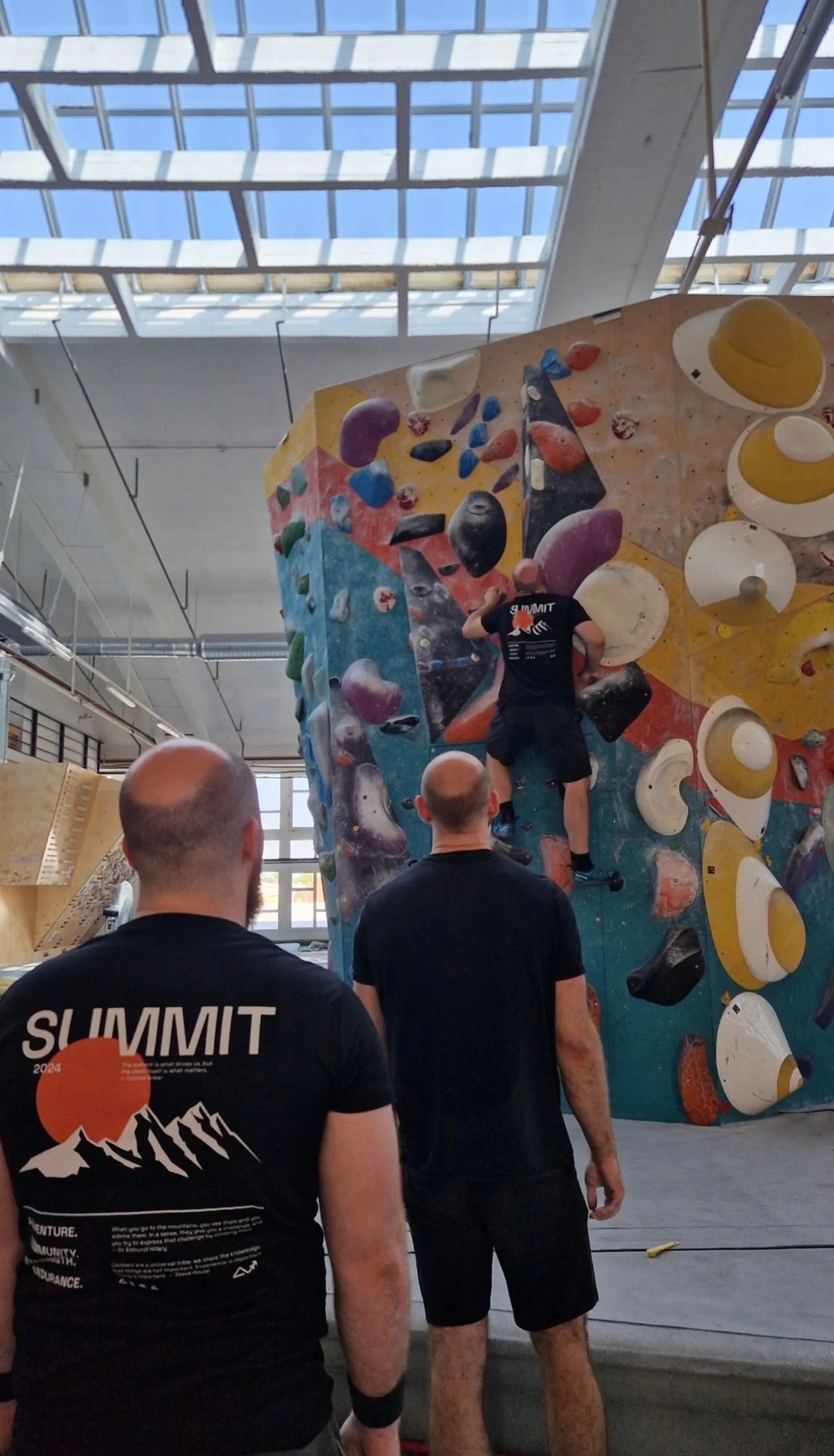
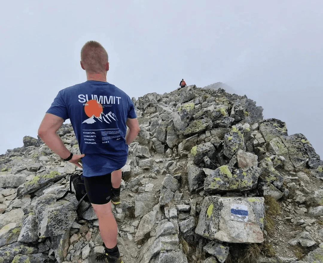
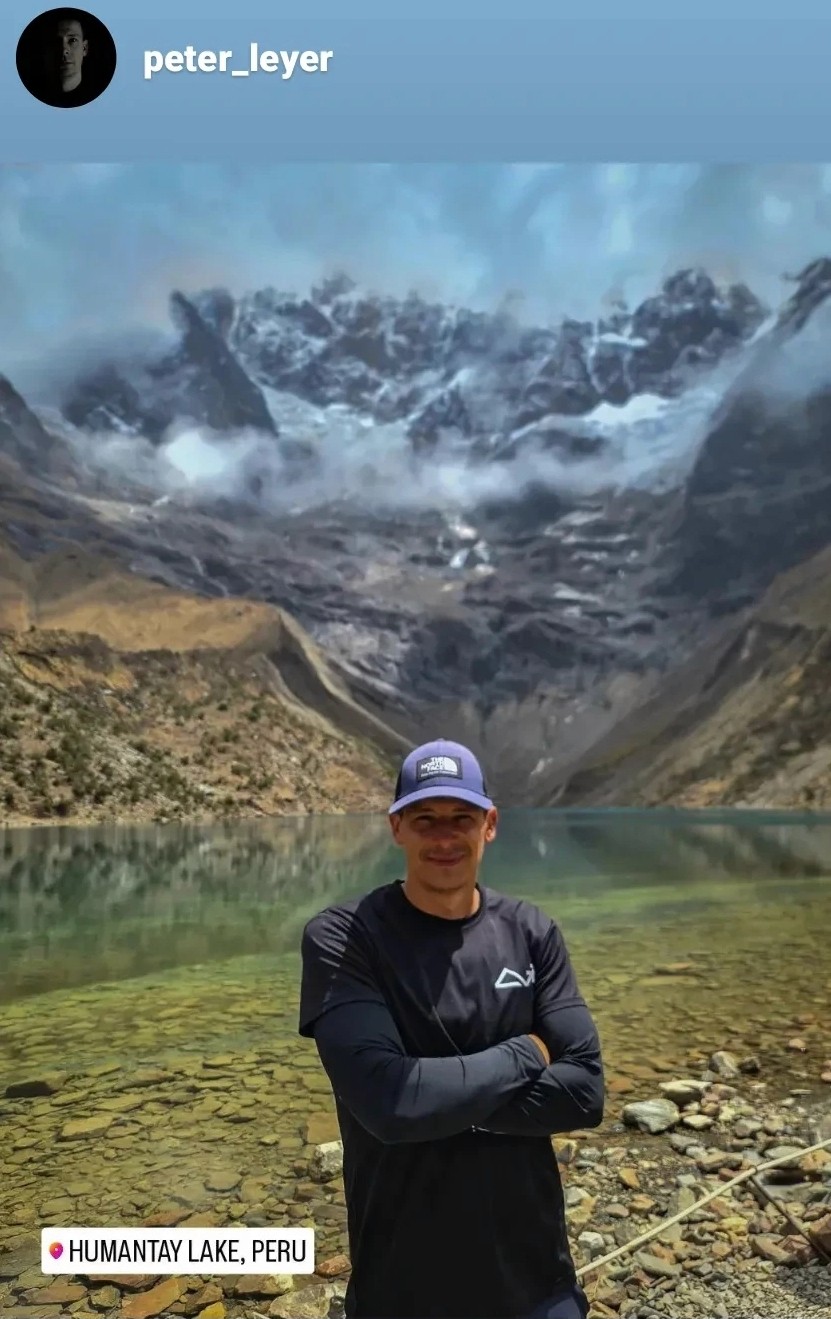
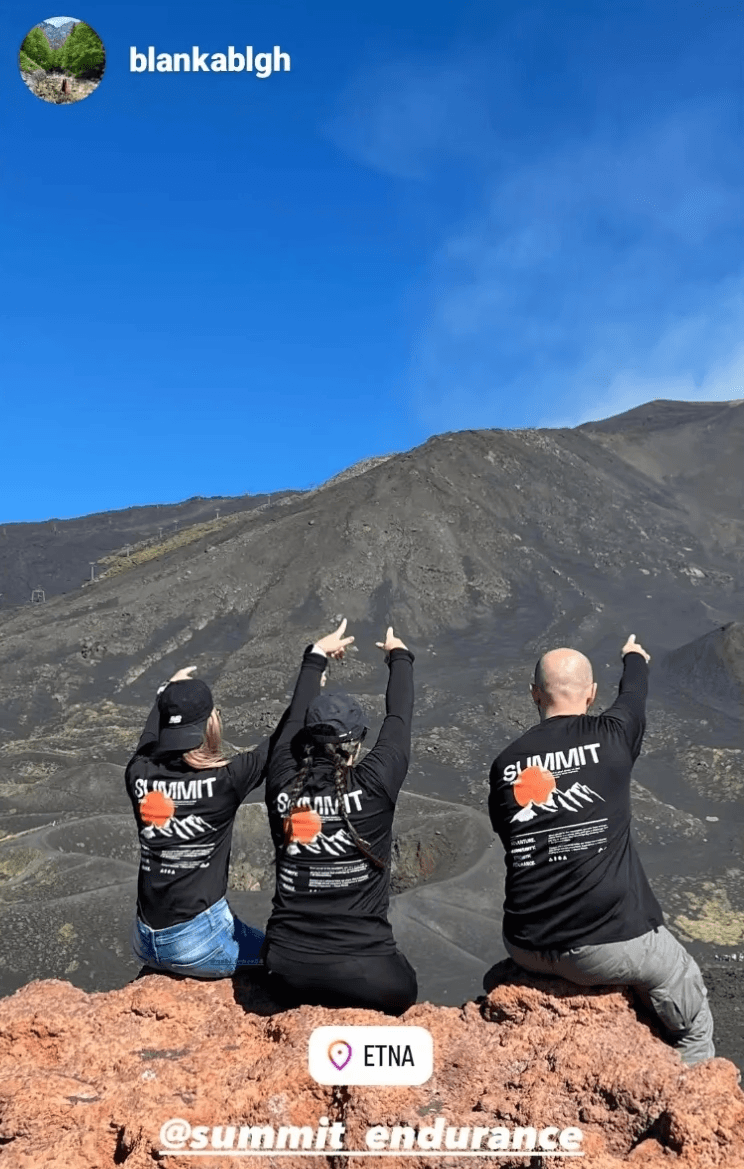
We designed a unique adventure-themed T-shirt that combines Summit’s key brand phrases with inspiring quotes from legendary mountain climbers. The goal was to motivate athletes during each training session with words that reflect their personal journey. These designs have already made their way worldwide to stunning locations like Peru and Mount Etna, and Daniel’s pupils couldn’t get enough of them. The T-shirts have become a favourite, both in the gym and on outdoor adventures.
We designed a unique adventure-themed T-shirt that combines Summit’s key brand phrases with inspiring quotes from legendary mountain climbers. The goal was to motivate athletes during each training session with words that reflect their personal journey. These designs have already made their way worldwide to stunning locations like Peru and Mount Etna, and Daniel’s pupils couldn’t get enough of them. The T-shirts have become a favourite, both in the gym and on outdoor adventures.








09
09
09
Making the Website
Making the Website
Making the Website
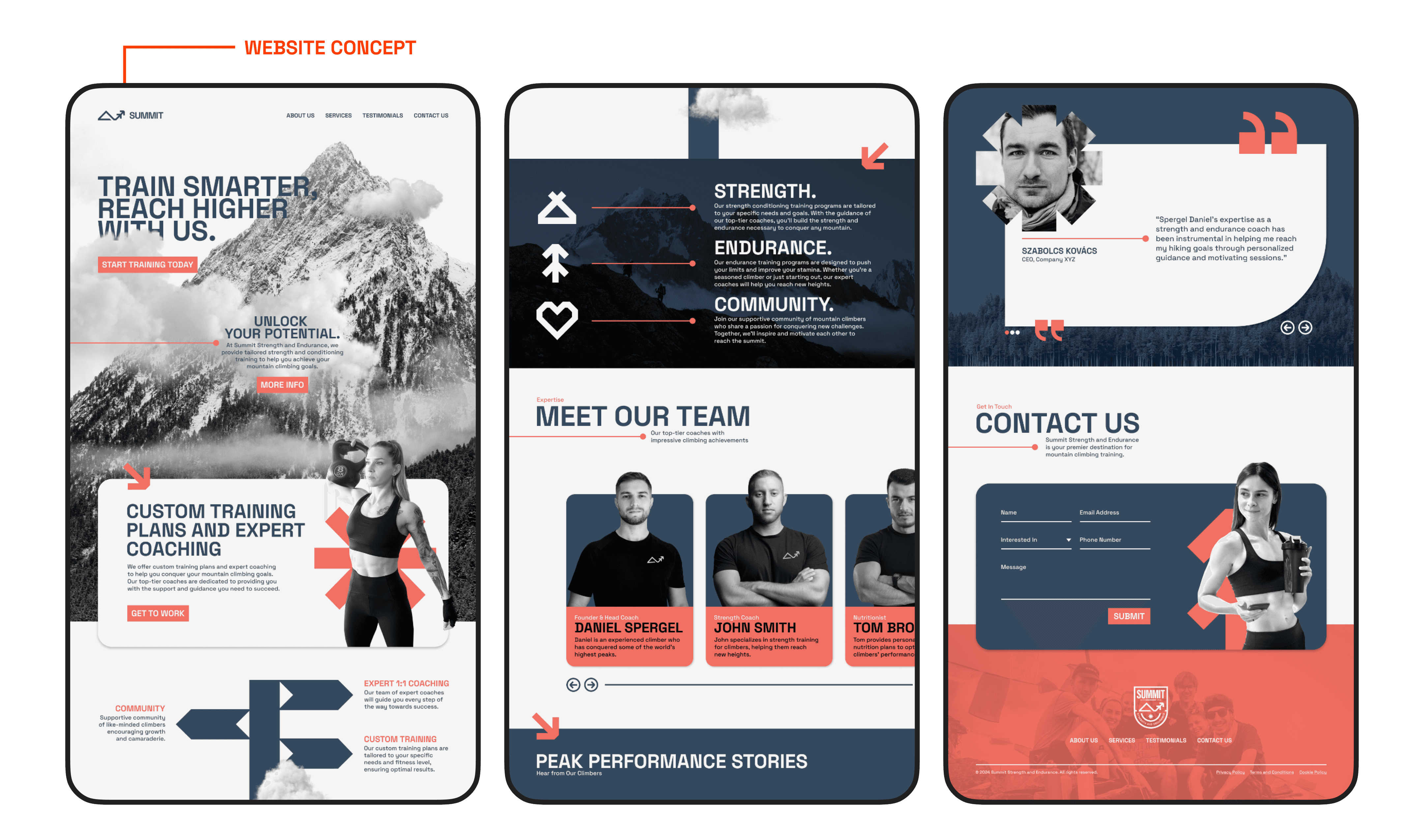
For Daniel and his brand, Summit, we crafted a custom sitemap and wireframes in Relume to ensure the website was not only logical but also aligned with his vision. Each section had a clear purpose, with the landing page specifically designed to build trust with home gym enthusiasts. Our goal was to show the value of being part of the Summit community and having Daniel as a coach—highlighting how this support leads to better, faster results compared to training alone at home.
We stayed true to Summit’s brand identity, carefully using its established styles, tone, and visual elements to ensure consistency across the web design and all other digital and printed materials. The final design reflected Summit’s ethos, featuring bold and inviting elements that engage visitors and keep them exploring the site while experiencing the energy and professionalism Daniel brings to his coaching.





Review from the Founder
Review from the Founder
"Friendly and professional attitude. Knowledgeable and helpful in every aspect. Throughout every step of our collaboration, the project was handled with sufficient attention and professionalism, and I was completely satisfied throughout. Everyone highly appreciated the result. I recommend Humbl Creatives to anyone looking for a graphic designer."
"Friendly and professional attitude. Knowledgeable and helpful in every aspect. Throughout every step of our collaboration, the project was handled with sufficient attention and professionalism, and I was completely satisfied throughout. Everyone highly appreciated the result. I recommend Humbl Creatives to anyone looking for a graphic designer."
Daniel Spergel
@summit_endurance


